
A stock chart can look like a random collection of candles until you begin reading its structure. Trend analysis gives that movement a framework. It asks a simple question: is price generally progressing upward, downward or neither?
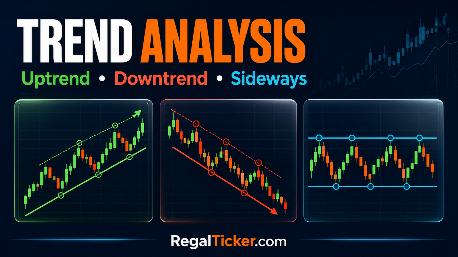
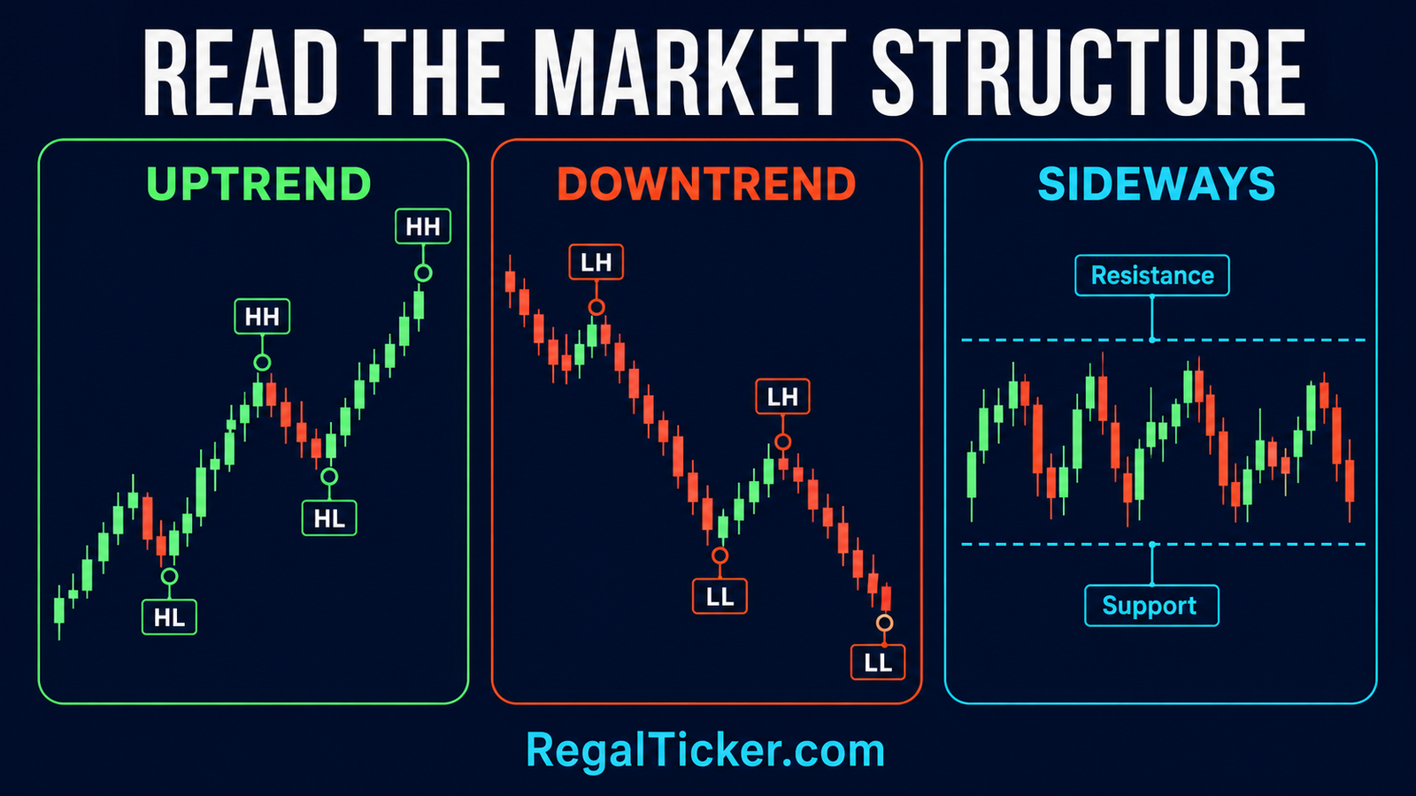
An uptrend normally forms a sequence of higher highs and higher lows. A downtrend forms lower highs and lower lows. A sideways market repeatedly moves between support and resistance without sustained progress in either direction.
These descriptions do not predict the next candle. They organise what price has already done so that traders can place support, resistance, patterns and indicators in the correct context. If these foundations are new, first read What Is Technical Analysis? Meaning, Tools and Examples and How to Read Candlestick Charts: A Beginner’s Guide.
What Is Trend Analysis in the Stock Market?
Trend analysis is the study of price direction across a selected period. Instead of reacting to one green or red candle, an analyst examines a sequence of swing highs and swing lows.
A swing high is a visible peak from which price turns lower. A swing low is a visible trough from which price turns higher. When these pivots progress consistently, they reveal market structure.
| Trend | Swing structure | Basic interpretation |
|---|---|---|
| Uptrend | Higher highs and higher lows | Buyers are accepting progressively higher prices |
| Downtrend | Lower highs and lower lows | Sellers are accepting progressively lower prices |
| Sideways | Similar highs and similar lows | Price is rotating within a range |
Trend analysis is part of technical analysis, which SEBI’s investor-education material describes as the study of price movements, patterns and trading volume. The official overview also contrasts it with company-focused fundamental analysis: SEBI Investor — Technical vs Fundamental Analysis.
Trend Is Direction, Not a Promise
An uptrend can reverse, and a downtrend can recover. A sideways range can break in either direction. Trend classification is therefore evidence about current structure—not a guarantee of future returns.
It also differs from the broader bull, bear and sideways market cycle. A broad index may be in a bull market while one stock is in a short-term downtrend. Learn the macro distinction in Bull Market, Bear Market and Sideways Market Explained.
How to Identify Uptrend, Downtrend and Sideways Market
Uptrend: Higher Highs and Higher Lows
An uptrend develops when buyers repeatedly push price above its previous swing high, while pullbacks stop above the previous significant swing low.
The sequence is:
- Price creates a swing high.
- A pullback forms a low.
- The next advance exceeds the earlier high, creating a higher high.
- The next pullback remains above the earlier low, creating a higher low.
Both parts matter. A new high without a higher low may be only a temporary spike. Conversely, a higher low is encouraging but does not fully establish continuation until buyers also overcome an important prior high.
Downtrend: Lower Highs and Lower Lows
A downtrend shows the opposite behaviour. Rallies fail below previous swing highs, while selling drives price beneath previous swing lows.
Each lower high suggests that buyers could not recover the earlier peak. Each lower low shows that sellers were able to extend the decline. A single red candle is not a downtrend; the sequence across meaningful pivots is what matters.
Sideways Market: A Defined Range
In a sideways or range-bound market, price oscillates between an upper resistance area and lower support area. The swing points may not be identical, but neither side produces sustained follow-through.
This condition often reflects temporary balance. Buyers become active near the lower area, sellers emerge near the upper area, and price rotates until new information or stronger participation changes that balance.
Read Support and Resistance in the Stock Market: Beginner’s Guide before drawing a range. Support and resistance are zones, not perfectly precise lines.
How to Draw and Validate a Trendline
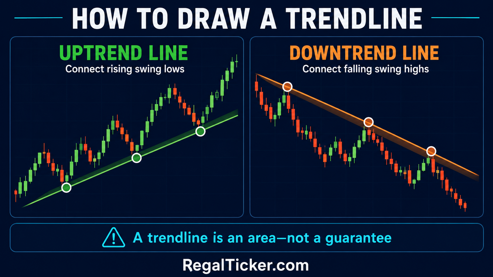
A trendline is a diagonal guide drawn beneath rising swing lows in an uptrend or above falling swing highs in a downtrend. It helps visualise pace and direction, but it does not create the trend.
Drawing an Uptrend Line
- Find two clear rising swing lows.
- Connect them without cutting through large sections of price.
- Extend the line forward.
- Treat a later touch as additional validation.
The second point makes the line possible; a third reaction makes it more meaningful. Avoid moving the line repeatedly merely to preserve a bullish view.
Drawing a Downtrend Line
Connect two meaningful falling swing highs and extend the line. A later rejection near that area adds evidence that sellers remain active.
What Makes a Trendline Useful?
| Better evidence | Weaker evidence |
|---|---|
| Connects obvious swing points | Connects tiny, arbitrary fluctuations |
| Has multiple respected touches | Exists only because the analyst forced it |
| Matches the broader price structure | Contradicts the swing-high/swing-low sequence |
| Leaves room for normal volatility | Treats every small intraday breach as a reversal |
A trendline should be treated as an area of attention, not an invisible wall. Price can briefly cross it and then resume the trend. Conversely, price can preserve the line while momentum and market structure weaken.
Why Timeframe Changes the Trend
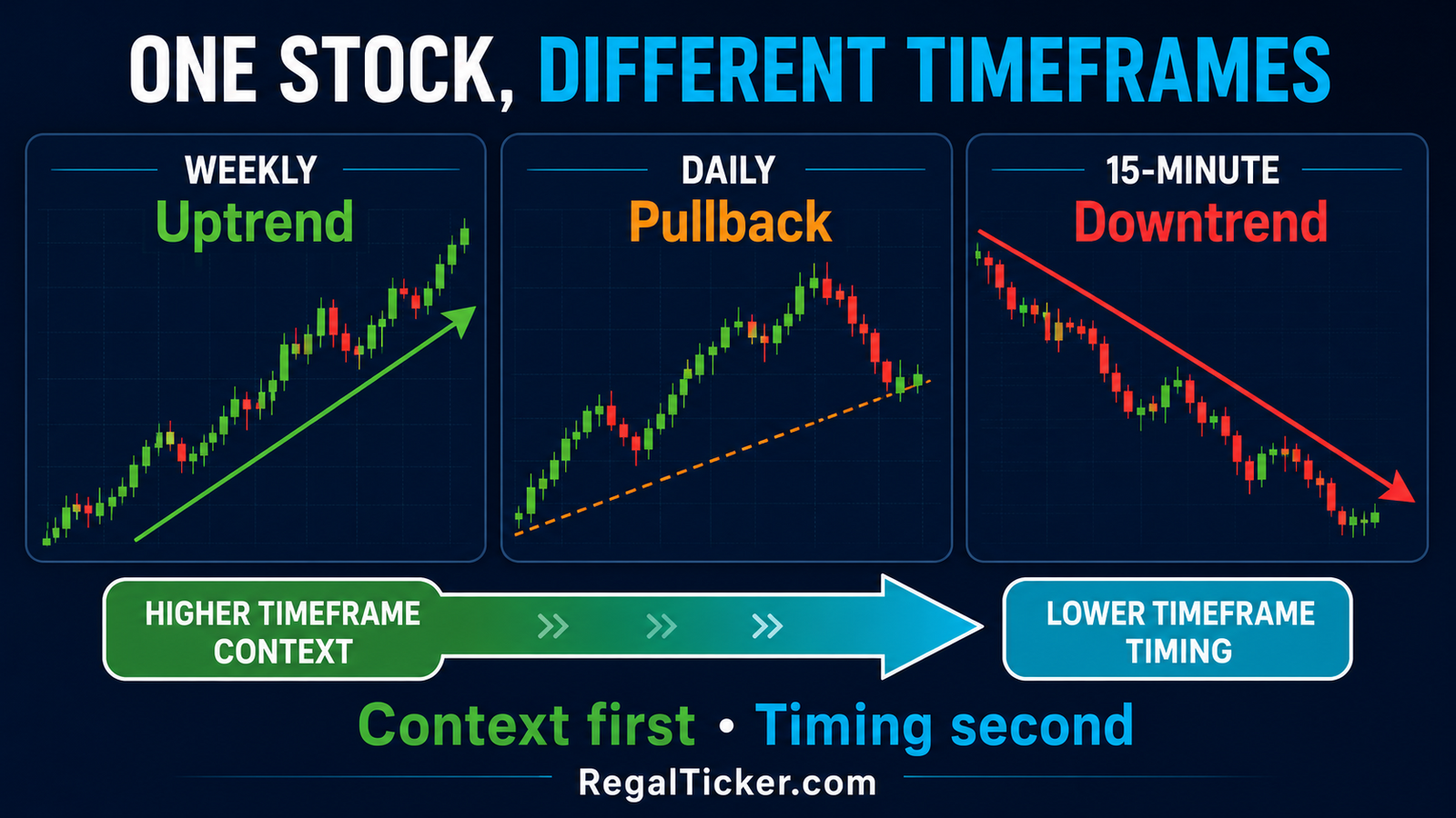
The same share can show several trends simultaneously:
- A weekly chart may show a long-term uptrend.
- A daily chart may show a pullback inside that uptrend.
- A 15-minute chart may show a short-term downtrend during the pullback.
None of these views must be “wrong.” They answer different questions.
An investor analysing a multi-year holding period may prioritise weekly and monthly structure. A swing trader may study weekly context and daily timing. An intraday trader may use daily context before moving to hourly or minute charts.
A Practical Top-Down Method
- Select a higher timeframe that matches the broader decision.
- Mark its important structure and support/resistance zones.
- Move to the working timeframe.
- Check whether its trend aligns with or opposes the higher timeframe.
- Use a lower timeframe only for finer observation, not to erase the larger context.
Changing timeframes until one supports a preferred opinion is confirmation bias. Decide the relevant horizon before interpreting the chart.
Pullback, Reversal and Trend Change
A pullback is a temporary move against the prevailing trend. A reversal is a more meaningful change in structure. The difficult part is that every reversal begins as what initially looks like a pullback.
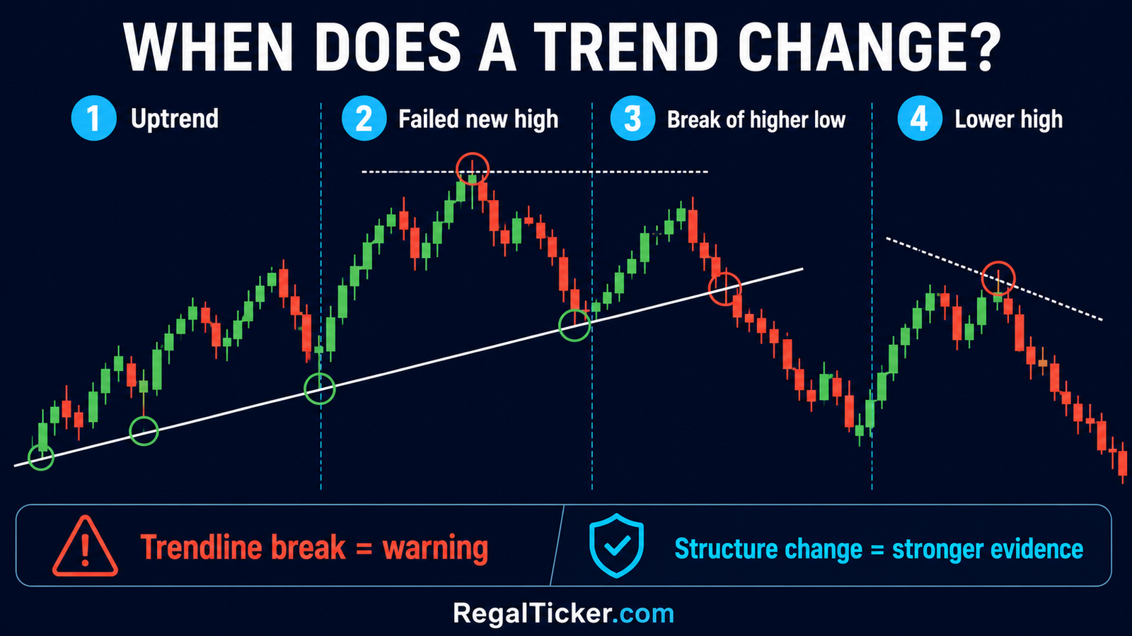
Signs an Uptrend May Be Weakening
- Price fails to establish a convincing new high.
- The latest advance has poor follow-through.
- Price breaks below an important higher low.
- A recovery forms a lower high.
- A new lower low develops.
In a downtrend, reverse the sequence: failure to make a new low, a break above an important lower high, then a higher low and higher high.
Is a Trendline Break Enough?
No. A trendline break is a warning, especially if the line was steep or loosely drawn. Stronger evidence comes from a change in the swing structure, a decisive close, participation through volume and follow-through after the break.
This is where the next lessons connect. Chart Patterns Explained: Reversal and Continuation Patterns examines formations that may develop during transitions, while the later volume and breakout lessons will explain confirmation in greater depth.
Using Trend Analysis Without Common Mistakes
Combine Structure With Support and Resistance
In an uptrend, an earlier resistance area may become support after a breakout. In a downtrend, old support may act as resistance after a breakdown. This is more informative than reading the trendline alone.
Use Volume as Supporting Evidence
Volume can show whether participation expands during an advance or breakdown. However, one high-volume candle does not override poor context. Treat volume as confirmation, not an independent verdict.
Keep Indicators Secondary
Moving averages, RSI and MACD can summarise direction or momentum, but they are derived from price. First identify structure; then use an indicator to answer a specific question. Indicator settings should not be changed repeatedly to manufacture a preferred signal.
Define Invalidation Before Acting
If an analysis depends on a higher low holding, decide what evidence would invalidate that view. A technically attractive chart does not remove gap risk, liquidity risk or company-specific news risk.
SEBI has repeatedly cautioned investors about unregistered advice and unrealistic claims. Verify the status of any person offering securities-market recommendations through the official SEBI Intermediary Portal and never treat a chart as assured profit.
Worked Example: Reading a Trend Step by Step
Suppose a fictional share moves from ₹180 to ₹205, pulls back to ₹192, rises to ₹224 and then retreats to ₹208.
- ₹224 is above ₹205: a higher high.
- ₹208 is above ₹192: a higher low.
- The visible structure remains upward.
Now suppose price rallies only to ₹218, falls below ₹208 and later recovers to ₹211 before declining again.
- ₹218 is a lower high relative to ₹224.
- The break below ₹208 damages the earlier higher-low sequence.
- The weak recovery to ₹211 supplies additional evidence of changing structure.
This does not guarantee a continued fall. It simply changes the weight of evidence from a clear uptrend toward transition or downtrend. The analyst must still consider timeframe, nearby support, volume and risk.
Trend Analysis Checklist
Before classifying a chart, ask:
- Which security or index am I analysing?
- What timeframe matches my actual decision?
- Where are the meaningful swing highs and swing lows?
- Are they rising, falling or roughly level?
- Does the trendline support the structure, or am I forcing it?
- Is price trending or rotating inside a range?
- Is an apparent break confirmed by structure and follow-through?
- What evidence would prove my interpretation wrong?
- Am I confusing a broad market cycle with one stock’s trend?
- Have I controlled risk rather than assuming the trend will continue?
Frequently Asked Questions
What is the easiest way to identify an uptrend?
Look for a sequence of higher highs and higher lows on the timeframe relevant to your decision. A rising trendline can support that reading but should not replace market structure.
What defines a downtrend?
A downtrend generally forms lower highs and lower lows. Rallies fail below earlier peaks, and declines extend below earlier troughs.
Is a sideways market the same as no volatility?
No. Price can fluctuate sharply within a range. Sideways describes the absence of sustained directional progress, not the absence of movement or risk.
How many touches make a valid trendline?
Two swing points allow a line to be drawn; a third respected touch strengthens its relevance. Quality and visibility of the pivots matter more than forcing a large number of touches.
Can a stock have two trends at the same time?
Yes. It can be in a weekly uptrend and a daily or intraday downtrend. Always state the timeframe when describing a trend.
Does breaking a trendline confirm a reversal?
Not by itself. It is a warning. A break of important market structure, followed by a lower high/lower low or higher low/higher high, provides stronger evidence.
Conclusion
Trend analysis begins with price structure. Higher highs and higher lows describe an uptrend; lower highs and lower lows describe a downtrend; repeated rotation between support and resistance describes a sideways market.
Use trendlines to organise the chart, not to force a prediction. Choose the timeframe first, distinguish pullbacks from confirmed structure changes and define invalidation before considering any action. The next lesson builds on this foundation by showing how reversal, continuation and bilateral chart patterns develop within market trends.