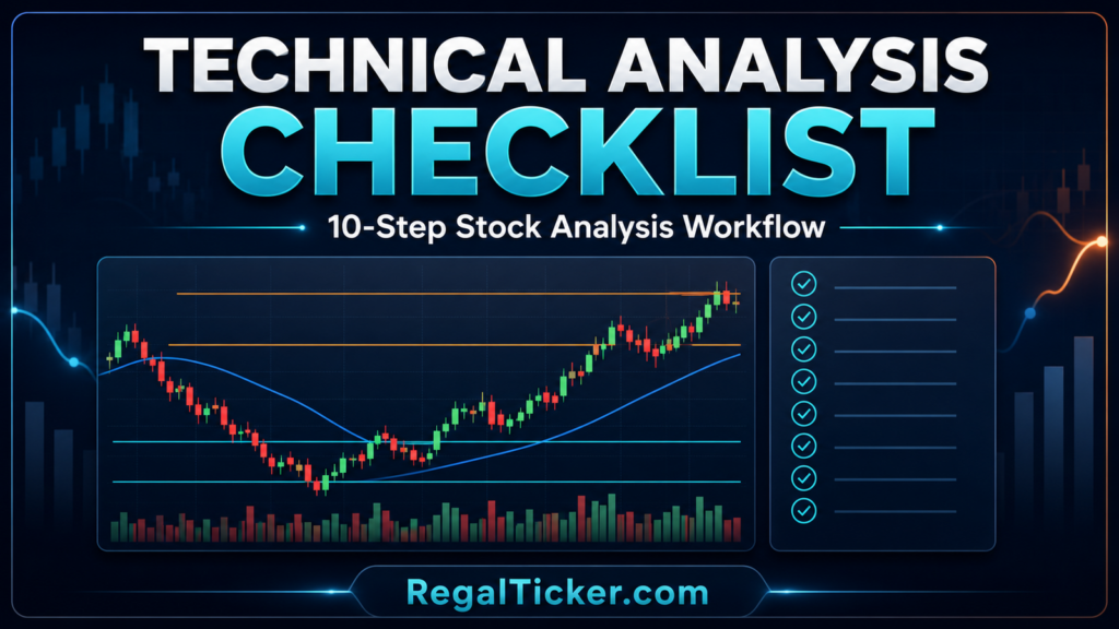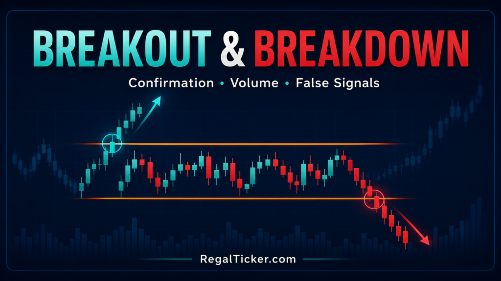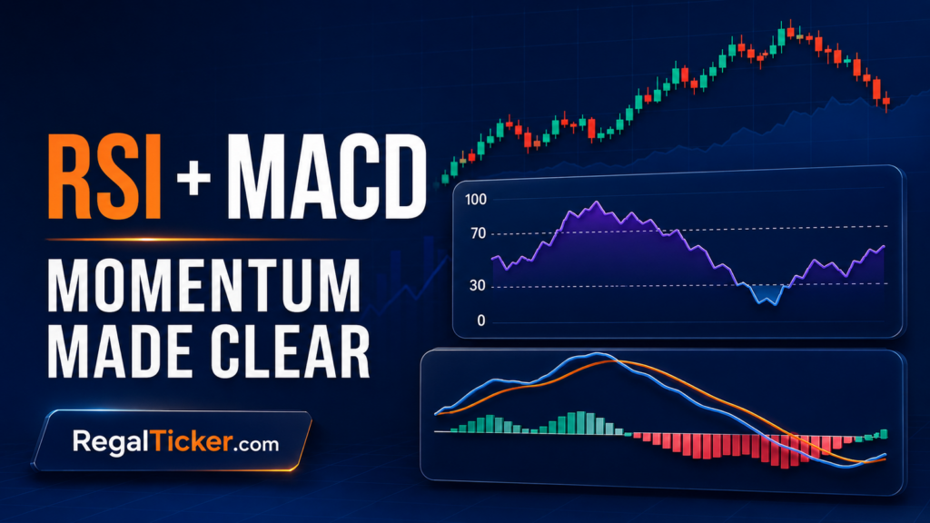


Every Candle Is a Short Market Story
A candlestick is not a green or red prediction symbol. It is a compact record of what price did during one selected period.
In a single candle you can see where trading began, the highest and lowest prices reached, where the period ended and how far price travelled between those points. That is why learning candlesticks should begin with open, high, low and close — OHLC — rather than memorising pattern names.
A hammer, doji or shooting-star-like shape can become useful later. But if you cannot first explain the body, wicks, range, timeframe and surrounding market context, the pattern name tells you very little.
If this is your first technical-analysis lesson, read What Is Technical Analysis? first.
⚡ Quick answer
To read a candlestick chart, identify four prices: open, high, low and close. The body shows the distance between open and close. The upper wick reaches the period’s high, while the lower wick reaches its low. If close is above open, the candle is bullish; if close is below open, it is bearish.
Then add context. Check the timeframe, compare body and wick size with recent candles, identify the broader trend and nearby support or resistance, review volume and see what later candles do. A candlestick records market behaviour; it does not guarantee the next move.
Key takeaways
Every candlestick represents open, high, low and close for one selected period.
The body connects open and close; the wicks show the full high-to-low range.
A bullish candle closes above its open; a bearish candle closes below it.
Candle colours are chart settings, not universal buy or sell signals.
Body and wick size should be judged relative to recent candles on the same timeframe.
The same stock can look different on 15-minute, hourly, daily and weekly charts.
Trend, location, volume and confirmation matter more than a candle name by itself.
Beginners should learn candle construction before memorising patterns.
What Is a Candlestick Chart?
A candlestick chart is a price chart in which each candle summarises one selected period of trading.
That period may be one minute, fifteen minutes, one hour, one day, one week or another interval offered by the charting platform. A daily candle summarises one trading session, while a fifteen-minute candle summarises only that fifteen-minute interval.
Each completed candle contains four core prices:
Open — High — Low — Close
These are commonly abbreviated as OHLC.
Candlesticks display the same core OHLC information as a bar chart, but the wider body between open and close makes direction and intraperiod range easier to see quickly.
Candlestick Anatomy: Open, High, Low, Close, Body and Wicks
Before interpreting candle colour or shape, identify the four prices.
Open
The open is the first traded price of the selected candle period.
High
The high is the highest traded price reached during that period.
Low
The low is the lowest traded price reached during that period.
Close
The close is the final traded price of the completed period.
On a live chart, the current candle is still forming. Its displayed close can therefore change until the timeframe ends.
⭐ Pro tip
Wait for the Candle to Close
If your method depends on a completed candle, do not analyse an unfinished candle as though its final body and wicks are already fixed.
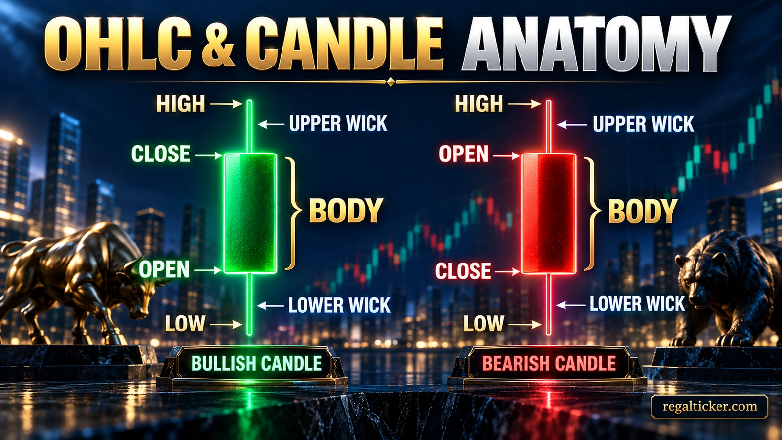
The body is the thicker area between open and close.
The upper wick extends from the top of the body to the high, while the lower wick extends from the bottom of the body to the low.
Together, the body and wicks show both where the period began and ended and how far price travelled beyond the open-close area.
Bullish, Bearish and Body Size
A candle is bullish when:
Close > Open
For example, if a candle opens at ₹100 and closes at ₹106, it finishes ₹6 above its open.
A candle is bearish when:
Close < Open
If it opens at ₹106 and closes at ₹100, it finishes ₹6 below its open.
When open and close are very close, the body becomes small. Depending on the exact shape, traders may describe it as doji-like or indecisive, but a small body does not automatically mean reversal.
❌ Myth
Green means buy and red means sell.
✅ Fact
Colour only shows the open-close relationship according to the chart’s settings. A bullish candle can appear inside a downtrend, and a bearish candle can appear inside an uptrend. Green and red are common chart colours, but platforms may use blue, white, black or custom colours. Read the open-close relationship, not just the colour.
What body size tells you
A relatively long bullish body shows strong open-to-close upward movement during that candle period.
A relatively long bearish body shows strong open-to-close downward movement.
A small body means open and close were relatively close and may reflect temporary balance, hesitation or weaker directional progress.
Always judge size relative to recent candles on the same instrument and timeframe. A ₹10 body may be enormous for one stock and ordinary for another.
Investor note
One Bullish Candle Is Not an Uptrend
One candle describes one period. A broader uptrend or downtrend requires price structure across multiple swings.
Learn that structure in Trend Analysis: Uptrend, Downtrend and Sideways Market.
What Candlestick Wicks Tell You
Wicks show where price travelled beyond the open-close body during the selected period.
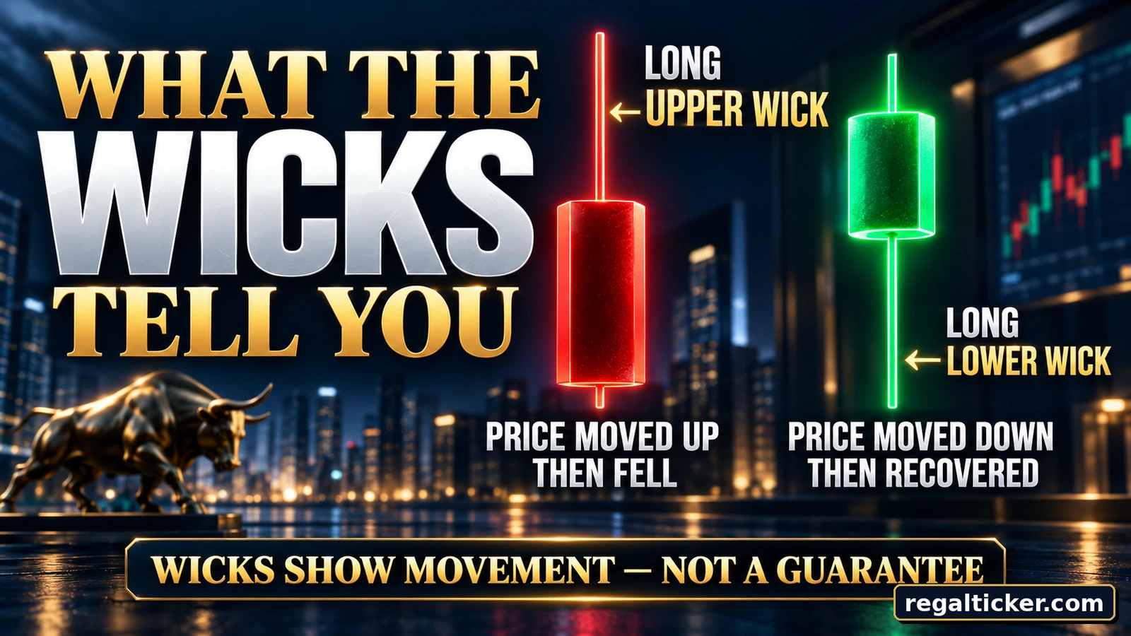
A long upper wick means price traded substantially above the body but moved down before the close. Depending on context, that can reflect selling activity at higher prices, profit-taking, failed continuation or simple volatility.
A long lower wick means price traded substantially below the body but recovered before the close. Depending on context, that can reflect buying activity at lower prices, short covering, failed downside continuation or volatility.
Short wicks mean price did not travel far beyond the open-close body. Long upper and lower wicks together can show large two-way movement.
Highlight
Rejection Is an Observation, Not a Guaranteed Reversal
A wick can show that price moved away from an extreme before the candle closed. It does not prove that the market must now reverse.
Candle Range and Volatility
The range is the distance between the candle’s high and low.
For a candle with:
- High: ₹108
- Low: ₹97
the range is:
₹108 − ₹97 = ₹11
A wider-than-normal range means more intraperiod movement, while a narrow range means less. But compare range with recent candles because volatility differs across instruments and timeframes.
A wide candle can result from directional movement, two-way volatility, corporate news, a market-wide event, a gap or poor liquidity. It should not automatically be labelled a strong trend candle.
Candlestick Timeframes: Same Market, Different View
A candle has no meaning without its timeframe.
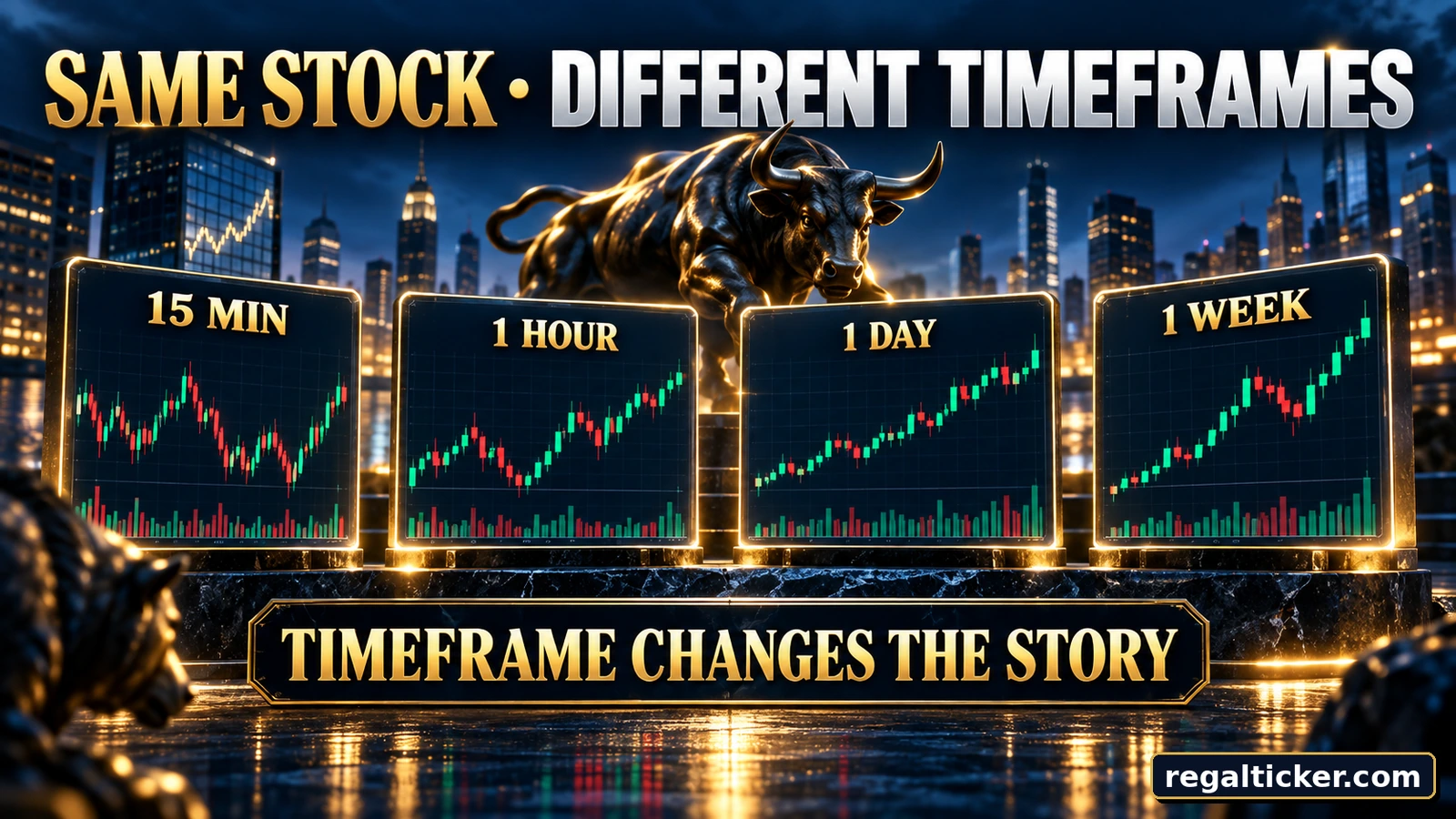
A fifteen-minute candle compresses fifteen minutes of trading into one OHLC structure. An hourly candle compresses one hour. A daily candle represents one trading session, and a weekly candle represents the trading week.
The same stock can therefore be rising intraday while moving sideways over several days and still be falling over several months. Those observations can all be true at once.
There is no universal “best” timeframe for beginners. The timeframe should match the decision being studied.
Broadly:
- intraday traders use shorter intervals;
- swing traders often use hourly and daily charts;
- positional traders may focus on daily and weekly charts;
- longer-term investors may use weekly or monthly charts for broader context.
⭐ Pro tip
Match the Timeframe to the Decision
Do not use a one-minute candle to justify a six-month thesis, and do not use a weekly candle to manage a trade intended to last ten minutes.
Read Candlesticks in Context
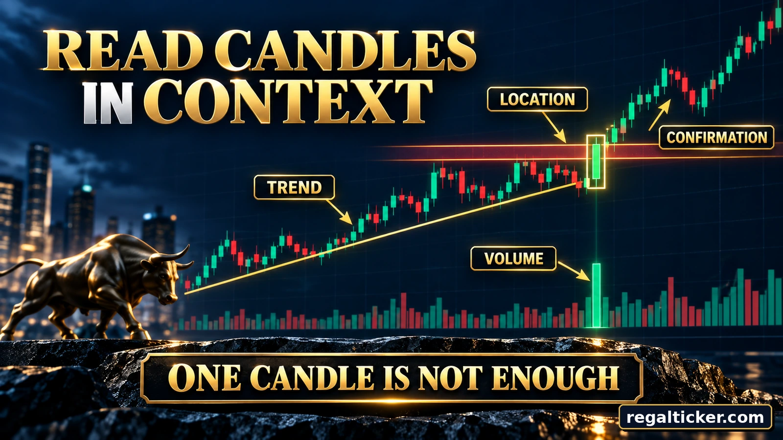
One candle by itself gives limited information.
A stronger chart reading asks:
What is the broader trend?
Is price generally rising, falling or moving sideways?
Where is the candle located?
A candle near support, resistance, a previous swing level or a breakout area can carry different context from the same shape in the middle of nowhere.
Learn these zones in Support and Resistance in the Stock Market.
What does volume show?
Volume adds information about market participation behind the move. Study it in Trading Volume in the Stock Market.
What happened next?
Later candles can confirm, weaken or reject the first interpretation.
Before You Interpret a Candle
- What timeframe am I looking at?
- Where are open, high, low and close?
- Is the candle bullish, bearish or near-neutral?
- Is its body large or small relative to recent candles?
- Are the upper or lower wicks unusually long?
- What is the broader trend?
- Is the candle near an important price zone?
- What does volume show?
- Is the security sufficiently liquid?
- What did the next candle or candles do?
Worked Example: Read One Candle from OHLC
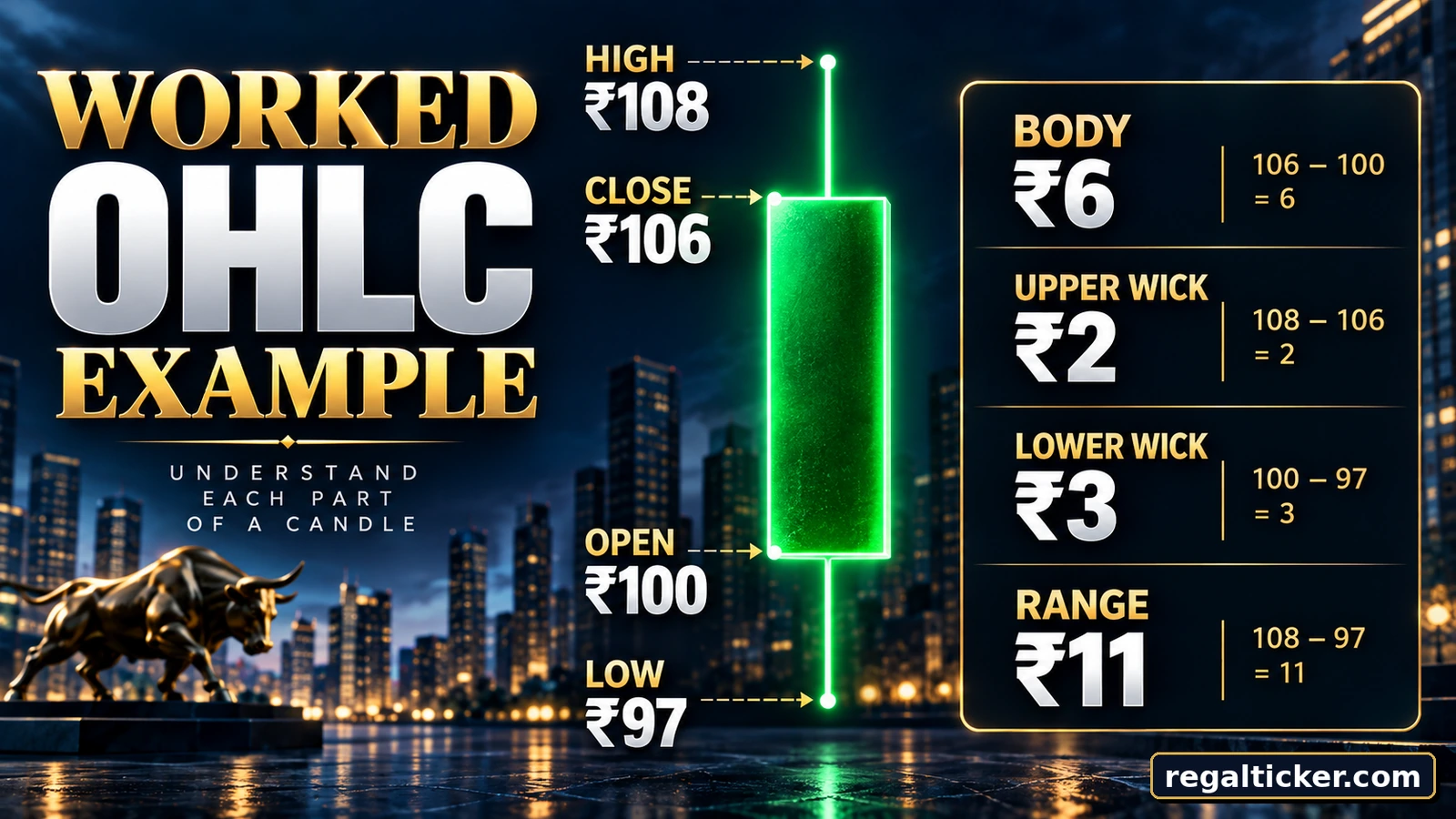
Consider a hypothetical daily candle with:
- Open: ₹100
- High: ₹108
- Low: ₹97
- Close: ₹106
💡 Real example
Reading a ₹100–₹108–₹97–₹106 Candle
The candle opened at ₹100, traded as low as ₹97 and as high as ₹108, then closed at ₹106.
Because ₹106 is above the ₹100 open, the completed candle is bullish.
Now measure the structure:
Body size = |₹106 − ₹100| = ₹6
Upper wick = ₹108 − ₹106 = ₹2
Lower wick = ₹100 − ₹97 = ₹3
Full range = ₹108 − ₹97 = ₹11
Objectively, you can say that the candle closed above its open, traded ₹3 below the open before recovering and traded ₹2 above the close before finishing at ₹106.
You cannot say from this candle alone that the next candle will rise, that a reversal has occurred, that resistance has broken or that volume confirms the move.
That requires broader chart context.
Common Single-Candle Shapes
Named candlestick patterns can become overwhelming, so begin with structure rather than memorisation.
A strong bullish candle has a relatively long bullish body and limited wicks.
A strong bearish candle has a relatively long bearish body and limited wicks.
A doji-like candle has an extremely small body because open and close are very close.
A hammer-like structure has a small body with a relatively long lower wick.
A shooting-star-like structure has a small body with a relatively long upper wick.
None of these names should be treated as a standalone prediction. Prior trend, location and later confirmation matter.
Memorising more candlestick names automatically makes you a better chart reader.
Understanding OHLC, body, wicks, timeframe, trend, location and confirmation is more useful than collecting pattern names without context.
Candlestick vs Line and Bar Charts
Different chart types organise price information differently.
Line Chart
- Usually plots one price point per period, commonly the close
- Clean and useful for broad direction
- Does not clearly show each period’s full high-low range
- Does not display candle bodies or wicks
Candlestick Chart
- Displays open, high, low and close
- Shows the open-close relationship visually
- Shows the full intraperiod high-low range
- Makes body and wick structure easy to compare
- An OHLC bar chart also displays open, high, low and close. The difference is mainly visual presentation: bars use a vertical line with open and close ticks, while candlesticks use a wider body.
Common Beginner Mistakes
Memorising names before understanding OHLC
Pattern names do not replace the ability to identify open, high, low and close.
Treating colour as a signal
Bullish does not automatically mean buy, and bearish does not automatically mean sell.
Ignoring the timeframe
A fifteen-minute candle and a weekly candle represent very different periods.
Reading one candle in isolation
Always check trend, location and later confirmation.
Calling every long wick a reversal
A long wick shows movement away from an extreme before the close; it does not guarantee reversal.
Analysing an unfinished candle as final
The current candle can change until its timeframe closes.
Ignoring liquidity and volatility
Illiquid securities can produce gaps and unusual candle structures. Relative body and wick size also depend on normal volatility.
Adding too many indicators too early
Learn to read price itself before covering the chart with indicators.
Trading without defining risk
Even a textbook-looking candle setup can fail. Review What Is Technical Analysis? for the broader risk framework.
A Beginner Practice Method
Use a clean chart and practise describing candles before trying to forecast them.
For practice, write observations such as:
“Daily candle closed above its open, had a long lower wick near a prior support area, and the next candle has not yet confirmed continuation.”
That is better training than simply writing, “The stock will go up.”
1
Choose a liquid stock or broad index
Use a security with regular trading activity so the chart is easier to interpret than an illiquid counter.
2
Select one timeframe
Stay with one consistent timeframe while learning instead of jumping between intervals to find a preferred signal.
3
Hide unnecessary indicators
Keep the chart simple so you learn price structure first.
4
Mark OHLC
Identify open, high, low and close on several completed candles.
5
Compare bodies and wicks
Note which candles have relatively large or small bodies and unusual upper or lower wicks.
6
Mark trend and location
Check whether the candle appears in an uptrend, downtrend, range, support area or resistance area.
7
Review volume
Note whether participation appears unusually high or low compared with recent activity.
8
Review what happened next
Record whether later candles confirmed, weakened or rejected your first interpretation.
Frequently asked questions
What is a candlestick chart?
A candlestick chart displays open, high, low and close prices for each selected period using a body and upper and lower wicks.
How do you read a candlestick chart?
Identify open, high, low and close first. Then examine the body, wicks and range. Finally, interpret the candle using its timeframe, broader trend, location, volume and later confirmation.
What does a bullish candlestick mean?
It means the candle closed above its opening price. It does not by itself mean the larger trend is bullish or that the next candle will rise.
What does a bearish candlestick mean?
It means the candle closed below its opening price. One bearish candle alone does not prove a downtrend.
What do candlestick wicks mean?
Wicks show the highest and lowest prices reached beyond the open-close body during the selected period.
What does a long upper wick mean?
Price traded higher during the period but moved lower before the close. Its significance depends on trend, location and other context.
What does a long lower wick mean?
Price traded lower during the period but recovered before the close. It is not automatically a bullish reversal signal.
What is the difference between candle body and range?
The body measures the distance between open and close. The range measures the distance between high and low.
Is a doji always a reversal signal?
No. A doji-like candle mainly shows that open and close are very close. Context and confirmation determine whether it matters.
Which candlestick timeframe is best for beginners?
There is no universal best timeframe. Daily charts can be easier to study because they move more slowly than short intraday charts, but the correct timeframe depends on the decision.
Can one candlestick predict the market?
No. A candle records what occurred during one period and cannot guarantee the next move.
Should beginners memorise candlestick patterns?
Not at first. Learn OHLC, body, wicks, timeframe and context before memorising named patterns.
What should I learn after candlestick charts?
Continue with Support and Resistance in the Stock Market, then learn trend, chart patterns, volume and other technical-analysis tools in sequence.
Verify through official sources
Official references
Final takeaway
Read the Story Before You Read the Pattern
A candlestick is a visual summary of open, high, low and close for one timeframe.
Start with the numbers. Then ask how large the body is, what the wicks show, how wide the range is, what timeframe you are viewing, what the broader trend is, where the candle is located and what happened after it closed.
When you can answer those questions without immediately reaching for a pattern name, you are genuinely learning to read candlestick charts.
The next lesson is Support and Resistance in the Stock Market.